
Five things that make an interface feel easy
Simplify the journey, focus on the content, personalise with care, be human, and use video properly — a design note I have been editing since 2020, including the one line in it that aged badly.
I started this note in 2020, while I was still doing more design than product, and I have edited it every year since. It tries to answer a question that sounds naive and is not: why do some interfaces feel easy and others feel like work, when both of them "look fine"?
The answer was never visual style. It is a handful of decisions underneath the style — about order, about emphasis, and above all about what you choose not to show.
1. Simplify the journey
Simplifying a journey means getting someone to what they came for in the fewest steps, and making each step hand cleanly to the next. Most of the work is in three ideas.
Linear design: one action at a time
Give the journey a beginning, a middle and an end, and at each point offer exactly the moves that make sense there. The clearest example I have is a writing-test screen I worked on years ago.
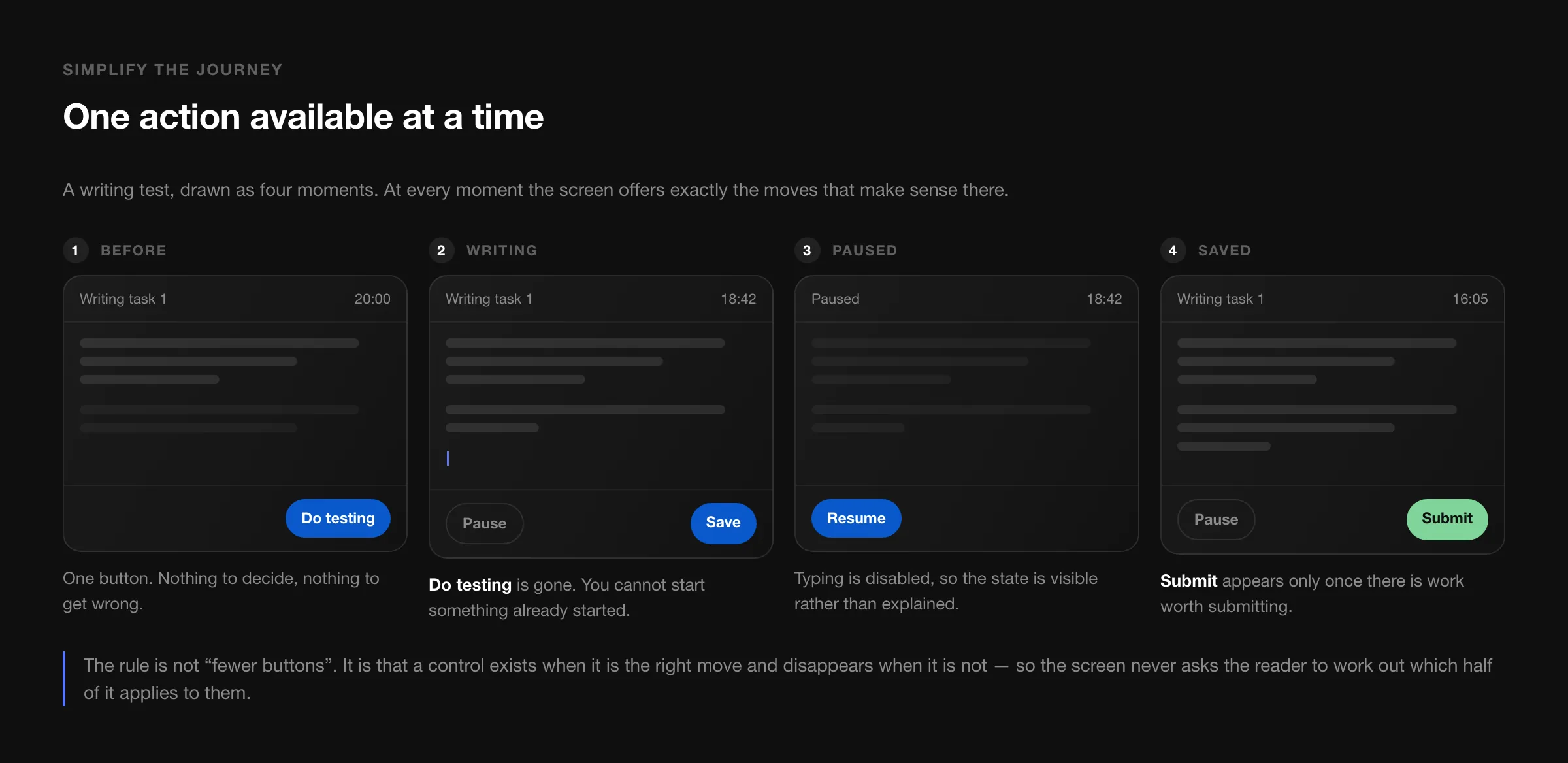
Before the test there is one button: Do testing. Once the test is running, that button is gone — you cannot start something already started — and Pause and Save take its place. Pausing disables typing, so the state is visible instead of explained. Submit appears only after a save, when there is work worth submitting.
The rule is not "fewer buttons". It is that a control appears when it is a valid move and disappears when it is not, so the reader is never asked to work out which half of the screen applies to them. The cost of getting this wrong is not confusion — it is hesitation, which is much harder to see in analytics and much easier to feel.
Anticipatory design: decide what is probably next
If you can predict the likely next step with reasonable confidence, prepare it. A date field that opens on the right month. An amount field that already has the keyboard up and the cursor in it. A currency that defaults to the one this person used the last nine times.
Anticipation has to be cheap to refuse. A default is a gift; a prediction you cannot undo is an argument. The test I use: if the guess is wrong, how many taps does it cost to fix? One is fine. Three means you have built an obstacle and called it a convenience.
Progressive disclosure: show the next thing, not everything
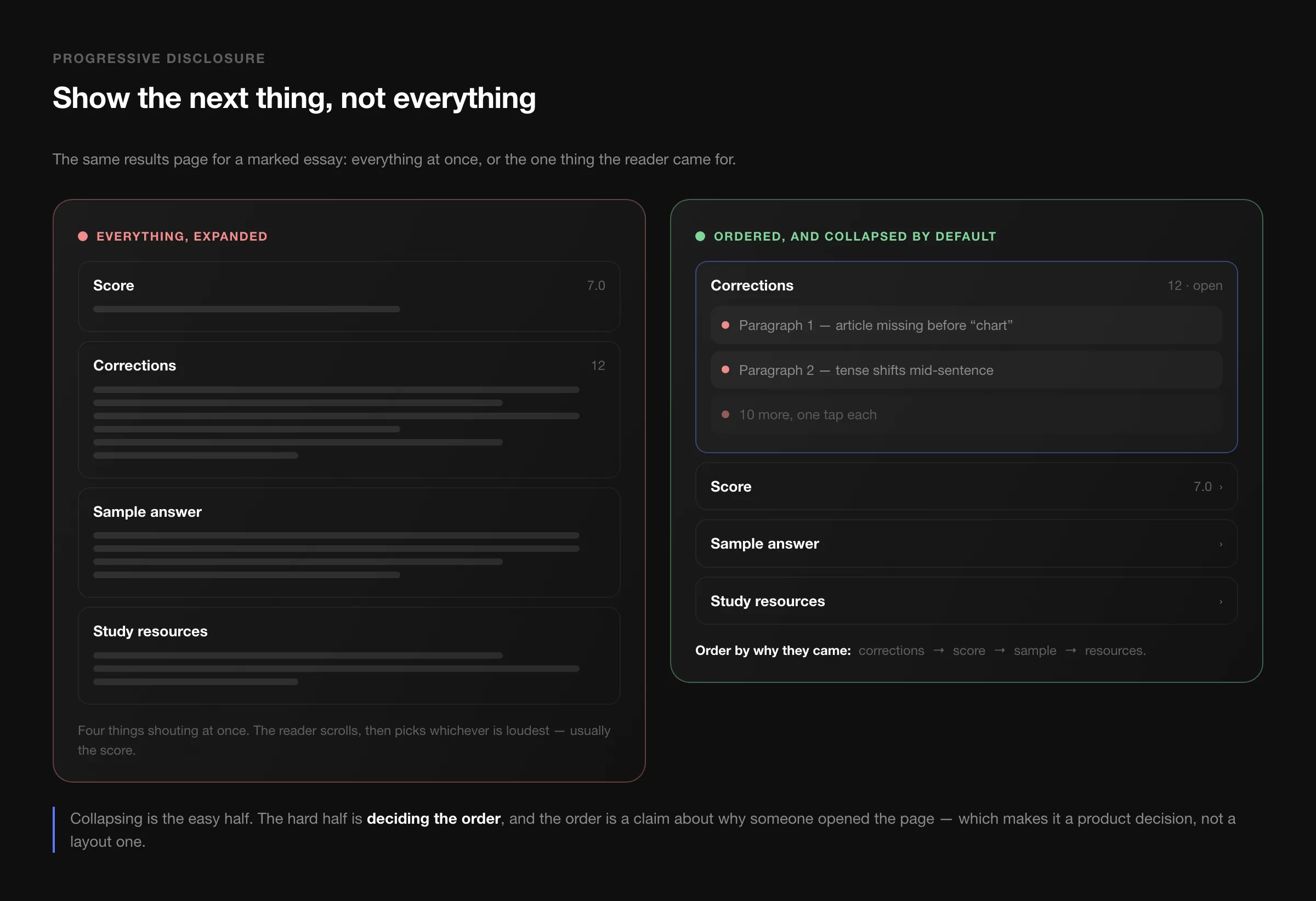
A marked essay comes back with four things attached: the corrections, the score, a sample answer, and study resources. Put all four on screen fully expanded and the reader scrolls, then latches on to whichever is loudest — usually the score, which is the least useful of the four for getting better.
Order them by why the person opened the page: corrections first and open, then score, then the sample, then resources. The corrections themselves expand one at a time. Nothing has been removed, and the page now has an answer to "where do I look first".
That ordering is a claim about intent, which makes it a product decision rather than a layout one. It is also testable — if most people open the score before reading a single correction, your claim was wrong.
Context-based information
The last piece of a simple journey is showing what is relevant here. A bank app opening on the balance when you are in a shop and on the transfer screen when you have just copied an account number. A support page that leads with the article about the feature you were using when you clicked Help. Context is free personalisation: you already know where the user is, so use it before asking them anything.
2. Focus on the content
Three habits carry most of this.
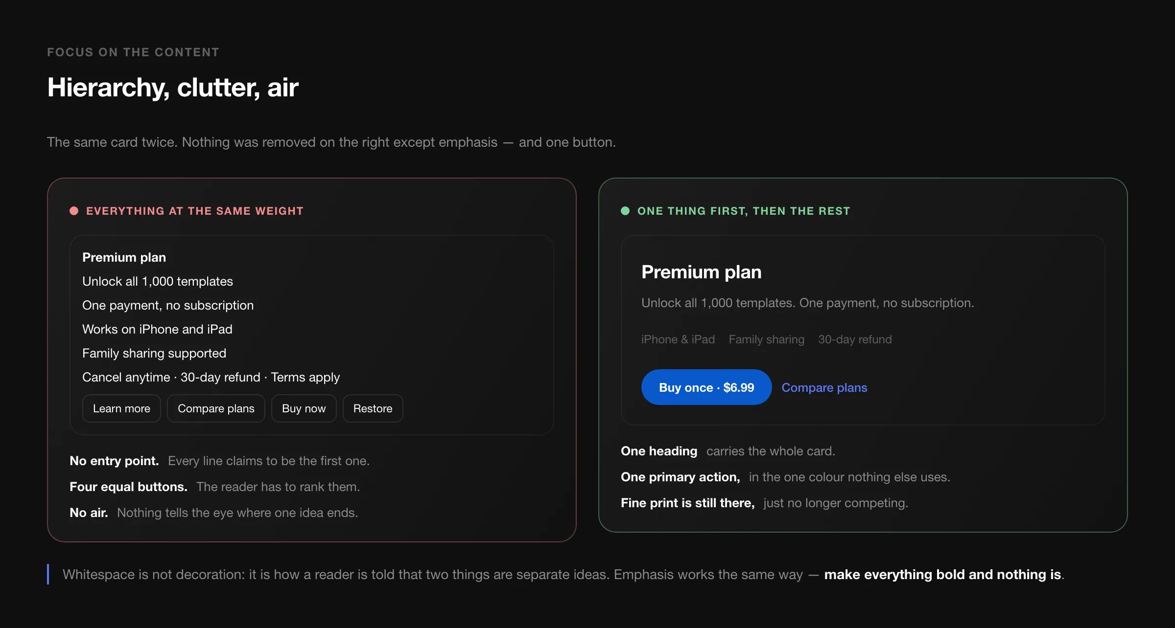
Hierarchy. Every screen should have one thing that is obviously first. If the heading, the body text and the fine print all weigh the same, the reader has to rank them, and ranking is work you were supposed to do for them. The same goes for actions: one primary action in a colour nothing else uses, everything else quieter.
Remove clutter. Not "remove information" — remove the details that are not helping right now. Terms and refund policies belong on a purchase screen; they do not belong at the same size as the price.
Whitespace. Space is not decoration, it is punctuation. It is how a reader is told that two things are separate ideas. Tightening the gaps to fit more above the fold reliably makes a screen harder to read and rarely makes anyone scroll less.
If you take one sentence from this section: make everything bold and nothing is.
3. Personalisation that earns its place
The version of personalisation worth building is not a greeting with someone's first name. It is giving different people different defaults because they are doing genuinely different jobs.
The example from my notes still holds. On a project tool, a manager's dashboard is about the team: who is blocked, where the week is going, which deadline is at risk. A team member's dashboard is about today: my tasks, in order. Same data, two completely different first screens — and building one screen for both produces a page that is nobody's.
Location and device are the other cheap signals: currency and language from the device, delivery estimates from the location, a simpler layout on a phone because the person is probably standing up. All of it should be overridable, and none of it should be a surprise. "Why is this app showing me prices in the wrong currency and where do I change it" is a worse experience than having asked once.
4. Be human
My original note called this "nhân bản" — making the digital thing respond the way a person would. In practice it comes down to micro-interactions and honesty.
Micro-interactions are the small responses that confirm something happened: the button that depresses, the row that slides away when deleted, the pull-to-refresh that resists slightly before letting go. They cost little and they are the difference between an interface that feels alive and one that feels like a form. The discipline is to keep them fast — anything you will see a hundred times a day should be under 200ms, and anything that blocks the next action should not be animated at all.
Honest feedback matters more than charm. An error message that says what failed and what to do next is worth more than any illustration of a sad robot. If something will take ten seconds, say ten seconds. If it failed because the network dropped, say that, and keep what the person typed.
One line in my 2020 note has aged badly and I am leaving it in with a correction: it suggested sharing emotion through face recognition. In 2020 that read as playful. Today, pointing a camera at someone's face to detect how they feel is a privacy decision before it is a design one — it needs a clear purpose, explicit consent, and on-device processing, and for most products the honest answer is that it is not worth it. Warmth can come from writing and timing instead, which cost nothing and expose nobody.
5. Video, used carefully
Video still outperforms text for showing a product in motion, with the same two rules as in 2020 — short and high quality — plus three that the last few years added:
- It must work muted. Most people will never hear it. If the point only lands with sound, the point does not land.
- Caption it. For accessibility first, and for the muted majority second.
- Never let it block the page. An autoplaying hero video that delays the first paint has cost you more visitors than it convinced. Poster image first, video after.
What ties them together
Looking at these five again, they are all versions of the same instinct: do the thinking on behalf of the reader. Decide the order, so they do not have to. Decide what matters, so they do not have to rank it. Decide the likely next step, and prepare it. Decide what is safe to hide.
An interface that feels easy is not one that did less. It is one where somebody already made the decisions you would otherwise be making while standing in a queue, holding a phone in one hand.